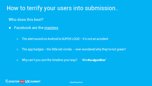
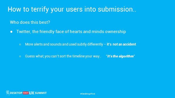
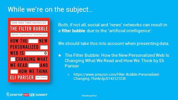
Here are the slides and links for the “how to terrify your users” session at the Desktop First Summit.
There’s a ton of extra useful links regarding UI and UX design at the end of this post.
I’ll link to the replay here when it becomes available. Be sure to catch my other session: “How to Give your Apps the REALLY COOL Windows 10 Fluent UI Look and Feel with Delphi“.
I am also speaking on two of the panels this week too. Register now if you haven’t and catch the sessions ‘on demand’ and say hi to me in the chat window if you’re around for the panel meetings.


Useful UI and UX links
Order Form Toy
https://codepen.io/jkantner/pen/xxVPbeB
CSS only elastic hover effect · Muffin Man
https://muffinman.io/elastic-hover-effect/
Wacky Buttons #3
https://codepen.io/AlexTaietti/details/rNewQgK
CodePen: Build, Test, and Discover Front-end Code.
https://codepen.io/
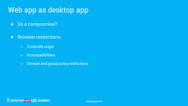
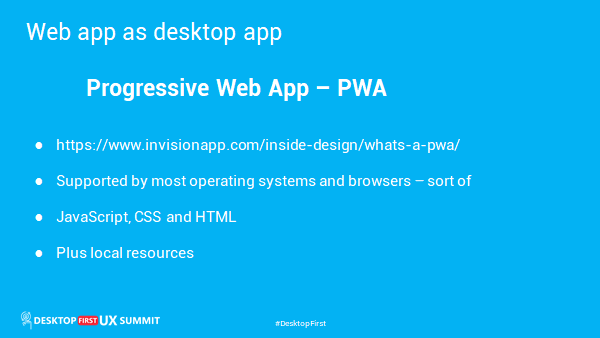
What’s a progressive web app, and why should designers care? | Inside Design Blog
https://www.invisionapp.com/inside-design/whats-a-pwa/
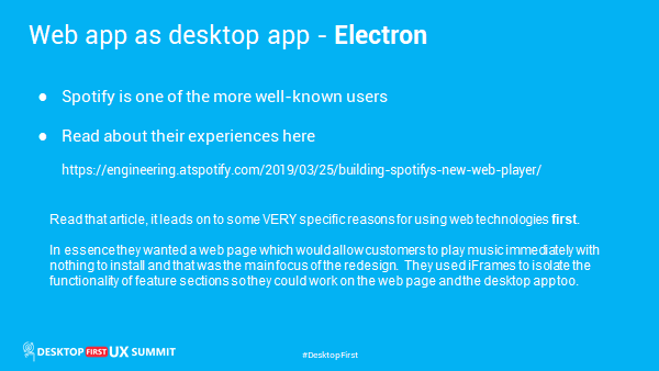
Building Spotify’s New Web Player : Spotify Engineering
https://engineering.atspotify.com/2019/03/25/building-spotifys-new-web-player/
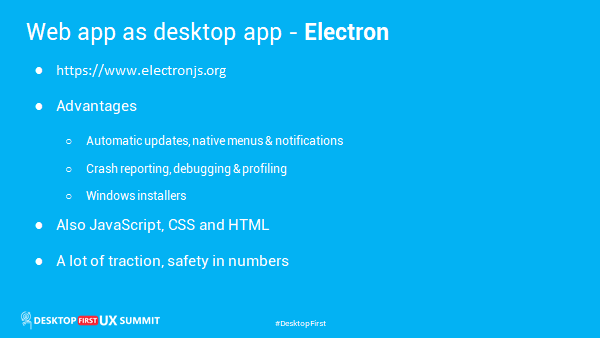
Electron | Build cross-platform desktop apps with JavaScript, HTML, and CSS.
https://www.electronjs.org
Electron Apps | Electron
https://www.electronjs.org/apps
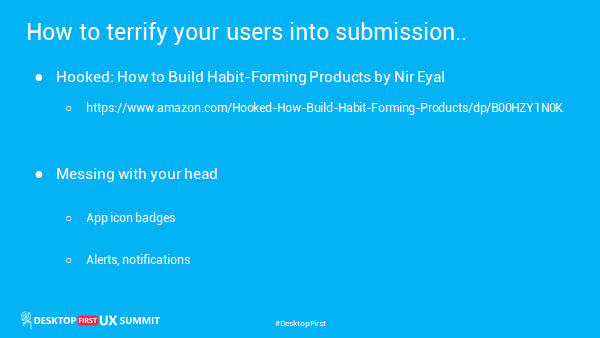
Amazon.com: Hooked: How to Build Habit-Forming Products (Audible Audio Edition): Nir Eyal, Ryan Hoover
https://www.amazon.com/Hooked-How-Build-Habit-Forming-Products/dp/B00HZY1N0K
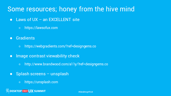
Home | Laws of UX
https://lawsofux.com
A11y accessibility check for text colour on background image
http://www.brandwood.com/a11y/?ref=designgems.co
Fresh Background Gradients | WebGradients.com ?
https://webgradients.com/?ref=designgems.co
Beautiful Free Images & Pictures | Unsplash
https://unsplash.com/
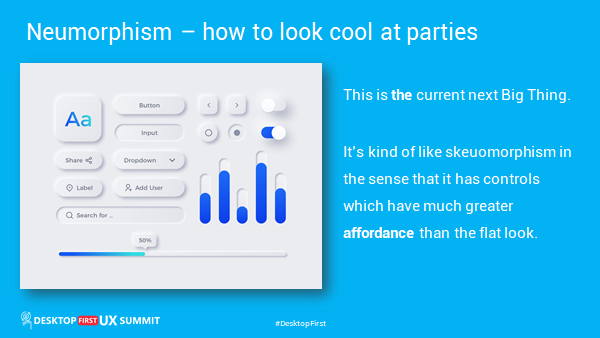
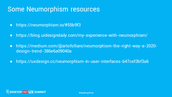
Neumorphism/Soft UI CSS shadow generator
https://neumorphism.io/#55b9f3
My Experience with Neumorphism (tips and resources)
https://blog.uidesigndaily.com/my-experience-with-neumorphism/
Neumorphism the right way — A 2020 Design Trend | by David Ofiare | Medium
https://medium.com/@artofofiare/neumorphism-the-right-way-a-2020-design-trend-386e6a09040a
Neumorphism in user interfaces. How UI trends reach for inspiration… | by Michal Malewicz | UX Collective
https://uxdesign.cc/neumorphism-in-user-interfaces-b47cef3bf3a6
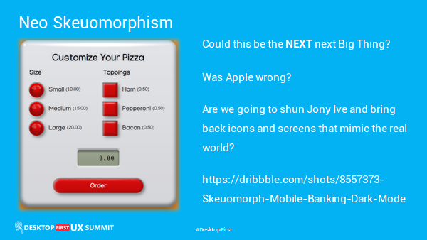
Skeuomorph Mobile Banking | Dark Mode ? by Alexander Plyuto ? for Heartbeat Agency on Dribbble
https://dribbble.com/shots/8557373-Skeuomorph-Mobile-Banking-Dark-Mode
2 thoughts on “How to terrify your users into submission and look cool at parties”
As always, great and i appreciate your insights.
The humor is just bonus points.
You are a decathlon programmer!
Thanks – Charlie Chambers
looks like some text missing below?
Ah yes, it looks like the theme is drawing gray text on a gray background. Kind of ironic seeing as the post relates to UI and UX design! I’ll fix that ASAP and check it once I can actually see straight again.
I’m glad you liked the talk. I try to make them a little more sprightly than the typical drone that sometimes falls out of webinars. Some people prefer things to be solidly technical and tedious but they’re also the kind of people with whom I don’t want to share a lifeboat if the situation ever arises. ?